↔️CSS Media Queries
light-level
This feature isn’t available in any browsers at the time of writing, but it definitely sounds like a future favorite. With the light-level media query, you can tune your styles based on whether your user is viewing your web app outside in daylight, or perhaps checking in before going to bed. This is great news for anyone who has ever tried to read their phone in the park, or check out a website at night!
There are three available values – dim, normal (the default), and washed.
Here’s an example where we change some CSS custom properties:
@media (light-level: dim) {
  :root {
    --text-color: white;
    --background-color: black;
  }
}
Read more at MDN.
inverted-colors
Currently supported in Safari (and Safari on iOS).
The value is boolean, so none and inverted.
@media (inverted-colors) {
  img {
    filter: invert(1);
  }
  * {
    box-shadow: none !important;
    text-shadow: none !important;
  }
}Preferences, preferences, preferences
The fifth level of CSS media queries also has a huge focus on personalization. It introduces no fewer than five distinct media queries that lets you tweak your website to whatever the user prefers!
prefers-color-scheme
This feature is already widely supported in browsers, and has three possible values – light, dark, and no-preference. Here’s an example where we change the background color of the site based on preference:
@media (prefers-color-scheme: dark) {
  body {
    background: #1e1e1e;
    color: white;
  }
}
color-scheme
The color-scheme CSS property and the corresponding meta tag allow developers to opt their pages in to the theme-specific defaults of the user agent stylesheet.
<meta name="color-scheme" content="dark light" />/*
The page supports both dark and light color schemes,
and the page author prefers dark.
*/
:root {
color-scheme: dark light;
}prefers-contrast
The prefers-contrast media query lets you cater to users who prefer high contrast content compared to your original design.
There’s two values here - no-preference and high.
@media (prefers-contrast) {
  :root {
    --text-color: black;
  }
}prefers-reduced-motion
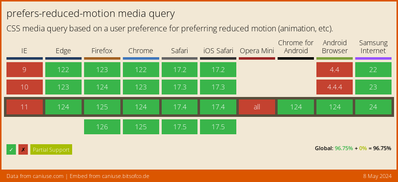
With the prefers-reduced-motion media query, you can respect that wish as well. Use it to reduce those “bouncy” animations, fading images and “fun” transitions a bit. Note that you don’t necessarily have to remove all movement, but reduce it.
Browser support is pretty good. The value is boolean, so no-preference or reduce.
@media (prefers-reduced-motion) {
  * {
    transition-duration: 0.05s;
  }
}
prefers-reduced-transparency
Some operating systems offer an option to reduce the amount of translucent layering effects used by the system. Although not supported by any browsers yet, the prefers-reduced-transparency media query is aiming to help you cater to those users.
The value is boolean, so no-preference and reduce.
@media (prefers-reduced-transparency) {
  .floating-box {
    opacity: 1;
  }
}prefers-reduced-data
The value is boolean, so no-preference and reduce are the values.
@media (prefers-reduced-data) {
  .hero-image {
    background-image: none;
    background-color: salmon;
  }
}pointer
The pointer CSS media feature tests whether the user has a pointing device (such as a mouse), and if so, how accurate the primary pointing device is.
Possible values are coarse, fine or none.
@media (pointer: coarse) {
  .hero-image {
    background-image: none;
    background-color: salmon;
  }
}hover and any-hover
The hover CSS media feature can be used to test whether the user’s primary input mechanism can hover over elements. The any-hover CSS media feature can be used to test whether any available input mechanism can hover over elements.
@media (hover: none) {
  /* do something when hover *IS NOT* available */
}

.cta {
}

@media (hover: hover) {
  /* do something when hover *IS* available */
  .cta:hover {
  }
}
If you’d like the query to be slightly broader to test if any available input can hover you can use the any-hover query instead.
This will apply to devices that allow for both touch and the connection of a pointer device like a mouse.
.cta {
}

@media (any-hover: hover) {
  /* do something when hover *IS* available */
  .cta:hover {
  }
}